Do They Point in the Same Direction as The Fundamentals?
Equities currently face a confluence of significant macroeconomic headwinds. Between elevated oil prices, elevated CAPE ratios, rising interest rates across Europe, and anticipated rate hikes in the US, the fundamental backdrop is strained. Furthermore, impending US elections introduce a recognized layer of market hesitancy as capital allocators await political clarity.
Conversely, the primary bullish tailwind—the artificial intelligence narrative—appears increasingly priced in, with valuations for mega-cap tech stalwarts (such as Alphabet and NVIDIA) heavily scrutinized for overextension.
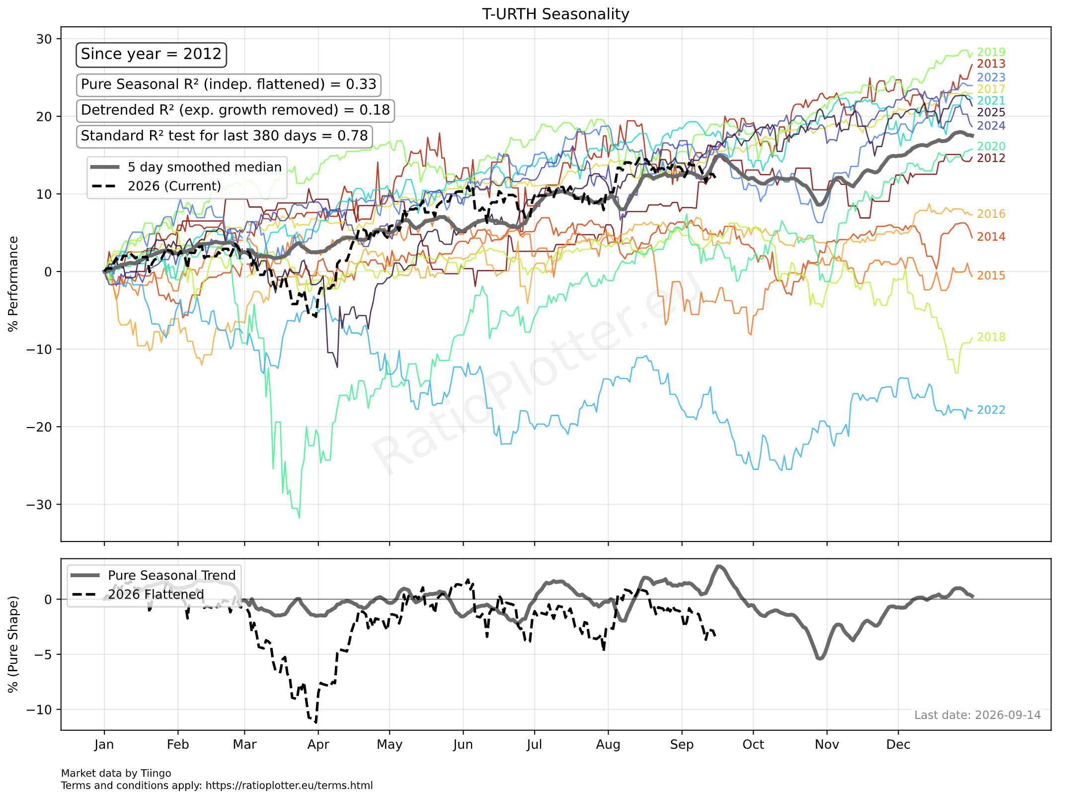
I assume you already know in which direction the fundamental winds blow and are looking for information on where the seasonal winds take us over the next weeks. In the absence of new fundamental information, we can better gauge the statistical probabilities of price action through the remainder of the year. The seasonality model presented indicates that 33% of the price movements above the exponential trend for the last 380 days of the iShares MSCI World can be explained by its yearly seasonality trend, which is mostly down by more than 5% from mid-September until end October.
Current Seasonal Outlook & Market Divergence
Based on the historical seasonality model for the last 14 years of price history from the iShares MSCI World (URTH), the market typically experiences a minor structural spike just before mid-September (thick grey line). However, as illustrated by the current year’s price action (the thick dotted black line), the market entirely ignored this anticipated rally, instead trending flat-to-down since the beginning of August.
Ignoring that failed spike, the dominant seasonal trend (represented by the thick solid grey line) projects a prevailing downward trajectory from the first week of September through the end of October.
Reserved for plotting an up-to-date chart.
Chart Anatomy & Methodology
To isolate true seasonal influences from random market noise or outlier events (e.g., the 2020 COVID-19 crash), the analytical engine applies a median-based aggregation rather than a simple mean.
Top Panel: Normalized YTD Performance
- Historical Years (Colored Lines): Each rainbow-hued line represents a distinct historical year. This utilizes Normalized Year-To-Date (YTD) logic, taking the first valid trading price of the year and plotting all subsequent price action as a percentage deviation from that origin.
- Composite Seasonality Curve (Thick Grey Line): This is the core seasonal trend, generated by calculating the median of the historical year lines. Using the median prevents anomalous events (like a sudden 50% drawdown in a single year) from artificially dragging the aggregate trend down, preventing false bearish signals. It includes a 5-day smoothing application and inherently carries the asset’s secular compound average.
- Current Year (Dotted Black Line): Tracks the active year’s price action (2026) to allow for immediate visual comparison against historical norms.
Bottom Panel: Pure Shape Isolation
- Flattened Curves (Grey and Dotted Black Lines): This panel neutralizes the exponential growth or decay inherent in the top panel to reveal the “pure shape” of the seasonal trend.
- Current Year Flattening: Rather than simply drawing a line from the start to the end point (which are single, volatile observations), the current year is flattened using a rigorous regression model that extracts and removes the mean growth rate.
Statistical Rigor: Out-of-Sample Validation
To ensure the seasonal model possesses genuine predictive power rather than merely fitting past data, the algorithm utilizes a strict out-of-sample holdout test. It deliberately hides the most recent 380 days of price action from the engine. A clean, isolated seasonal baseline is calculated using only older historical data, which is then tested against the hidden 380-day window.
The accuracy of this out-of-sample prediction is evaluated using three distinct R² metrics, each applying progressively stricter filters:
- Standard R² (Raw Comparison): Measures the direct correlation between the raw price action of the holdout period and the predicted seasonal curve. While indicative, this score is often artificially inflated by secular baseline drift (e.g., if an asset reliably compounds at 10% annually, both lines drift upward together, masking whether the specific seasonal peaks and troughs actually aligned). The R² here is high (78%) because the MSCI World has an overall bullish trend and the holdout data (the last 380 days) are also bullish. But what if we remove the exponential growth/decay from the comparison? See the next R² values.
- Detrended R² (Historical Growth Removed): This metric isolates the calendar signal by stripping the asset’s seasonal historical median compound growth rate out of both the prediction and the holdout data. However, this introduces a mathematical trap: if the current 380-day period diverges wildly from the seasonal history (e.g., experiencing a severe bear market despite historically bullish data), subtracting positive historical growth from a current crash artificially breaks the correlation. Be aware of this, and use this R² only if the current year follows the predominant trend (which it does so far). This R² is about 18%, which indicates their bullish trends differ somewhat.
- Pure Seasonal R² (Independently Flattened): To completely neutralize macroeconomic exponential growth/decay trends and resolve the detrending trap above, this Pure Seasonal R² acts as a zero-slope “Shape Correlation.” It independently levels both curves to a flat, horizontal axis using their own exponential growth/decay trend. Historical growth is removed from the seasonal prediction, while an independent regression extracts the actual realized trend from the last 380 days in the holdout data. By correlating only these leveled residuals, the Pure Seasonal R² of 0.33 proves exactly how much variance is driven by calendar effects, entirely independent of the asset’s broader bull or bear environment. In our chart about 33% of the price movements above the dominating exponential growth/decay trend are explained by the seasonal trend! Explained in the hold out data of the last 380 days.
Where next? Check some of our models on oil prices to understand how different assets relate to Oil. I look forward to your comments and analysis requests.
Subscribers can access the latest: Seasonality Model for URTH (iShares MSCI World).