RATIOPLOTTER.EU

Plot Seasonality for Ticker

Enter one financial asset ticker (e.g. T-USO-SplitAdjClose). You can copy tickers into a basket using the ticker selector.

Ticker Selector

Understanding Seasonality Models:

Find the best seasonality models ranked in: Seasonality insights page.

Read an article explaning how to interpret a seasonality model using the legend below: MSCI World Seasonality, Sep 2026.

Seasonality Chart Legend:

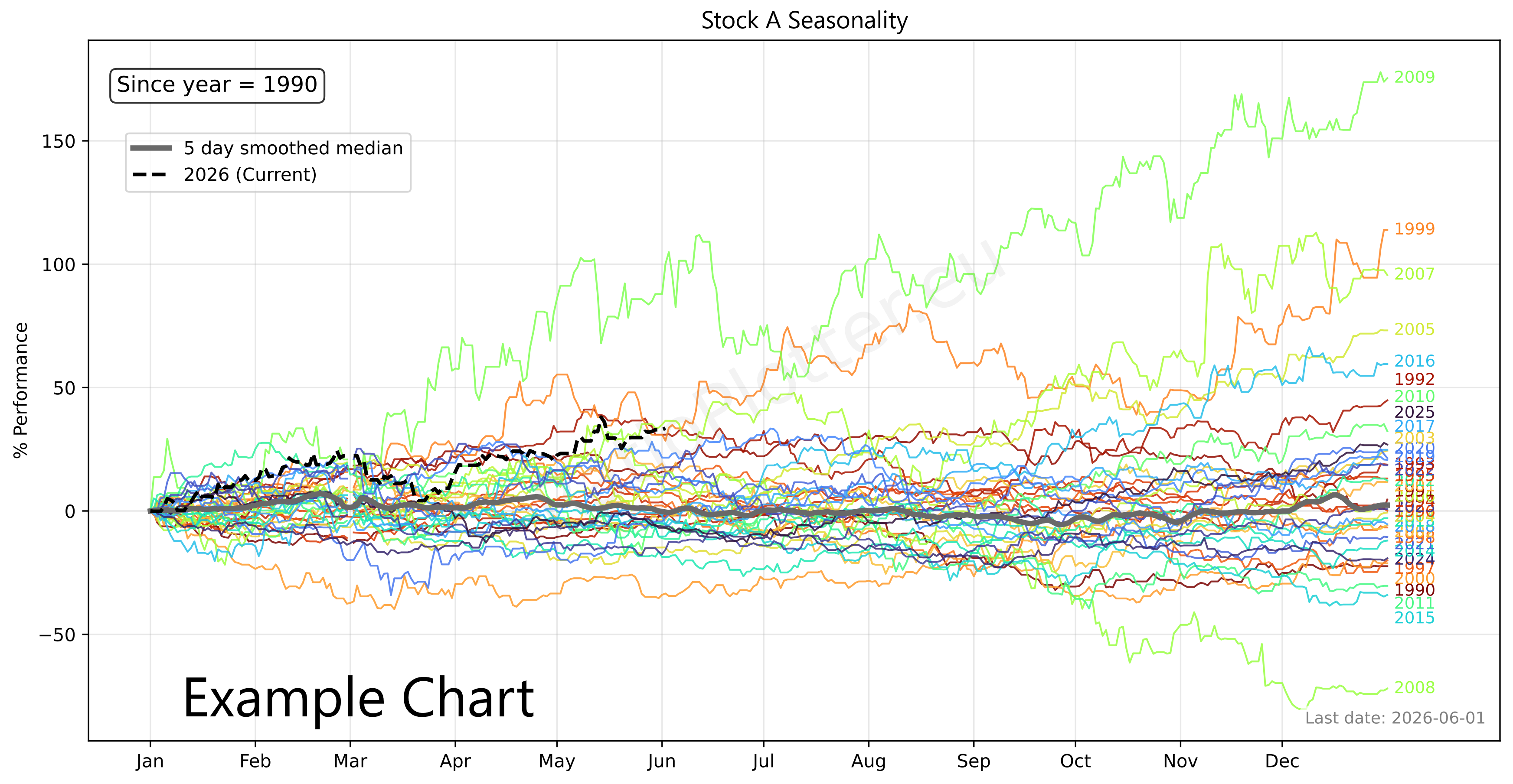
Colored lines (Normalized YTD for various years):
One line is shown for each historical year; the year lines are coloured in the sequence of the rainbow hues. This implements Normalized YTD logic by finding the first valid price of the year (usually Jan 1st) and recalculating the rest of that year as a percentage deviation from that start price.
Thick gray line (Composite, the seasonality curve = median of colored lines):
This is a robust aggregation of the coloured lines using the median rather than the mean. Why median? If one year had a massive 50% crash in March, the Median line will ignore it, whereas an Average line would drag the whole seasonal chart down, giving you a false bearish signal.
Black dotted line: the current year to date
This represents the current year. It is vital for seeing where the current price is trading relative to historical trends.
The Bottom Panel: flattened grey and black dotted lines.
We flatten the median seasonal trend to remove its exponential growth/decay component from start to end point. The method to flatten the current year is not by removing start to end exponential growth/decay, but by doing a regression and removing the mean growth, this is more robust for the case where the start and the end point values are just one observation and not the median.

The seasonality chart displays the full historical median trend, providing the most up-to-date visual of an asset's typical calendar behavior. However, to rigorously test if this pattern has true predictive power, the statistical engine performs a strict out-of-sample holdout test. The system slices off the most recent 380 days of price action and hides it from the algorithm. It then calculates an isolated seasonal trend using only the older historical data, creating a clean baseline to predict the hidden 380-day window.

The accuracy of this out-of-sample prediction is scored using three distinct R-squared metrics, each applying a progressively stricter lens to the data:

  • Standard R² (Raw Comparison): This measures how closely the raw price action of the last 380 days matches the predicted seasonal curve. While useful, this score is frequently inflated by an asset's underlying secular baseline. If an index reliably compounds at 10% annually, the Standard R² might look artificially high simply because both the prediction and the actual holdout data drifted upward together, masking whether the specific seasonal peaks and troughs actually aligned.
  • Detrended R² (Historical Growth Removed): To isolate the calendar signal, this metric strips the asset's historical median compound growth rate out of both the seasonal prediction and the 380-day holdout data before comparing them. It seamlessly factors out continuous exponential growth or decay. However, a mathematical trap occurs if the current 380-day period diverges wildly from history (e.g., a severe bear market during a historically bullish asset). Subtracting a positive historical growth trend from a current market crash will skew the holdout data further, artificially breaking the correlation.
  • Pure Seasonal R² (Independently Flattened): To completely neutralize macroeconomic noise and solve the detrending trap, this final metric acts as a Shape Correlation R² (zero-slope). It independently levels both curves to a flat, horizontal axis before testing them. The engine removes the historical growth from the prediction, but uses an independent regression to extract and remove the actual realized trend from the 380-day holdout. By correlating only these leveled residuals, this Leveled R² (isolated seasonal signal) proves exactly how much variance is driven by the pure seasonal shape, entirely independent of whether the asset experienced a bull or bear year overall.

Your Advertisement Here Advertise with us

Trading Notes & Guide

Ticker Data Usage and Sourcing

Ticker Data Sources
Our data is provided from a variety of sources: The Federal Reserve (FED-* tickers), The World Bank (WB-* tickers), The International Monetary Fund (IMF-* tickers), Tiingo (T-* tickers covering: stocks, ETFs, etc), Ourselves (MATH-* tickers). The ticker data sources vary according to ticker prefix as you can see. Our ticker selector allows browsing each ticker and their description and placing them on a basket for use.
RAT() Ticker function
The RAT() ticker function works by calculating the ratio between two tickers as a new dataset. This dataset is then directly inputted as an synthetic ticker into the plotting page arguments. To write custom RAT() tickers simply input your two tickers of choice between the parentheses, separating them with a comma. Such as RAT(T-AAPL, T-MSFT). Example, how is Google outpacing Microsoft in terms of CAGR curve: RAT(T-GOOGL,T-MSFT)/MATH-CAGR_PCT-2
LAG() Ticker function
The LAG() ticker function is used to create a lagged version of an asset. This lags a dataset with an amount of days equal to the lag value in the ticker. To write custom LAG() tickers simply input your ticker of choice and lag value between the parenthesis, seperated by a comma. Such as LAG(T-AAPL, 10). Lag values can only be inputted into the denominator as positive whole numbers between 1 and 7000 days. Using the ratio plotter with LAG(), a ticker can be analyzed in its auto correlation, or correlation to a nother ticker with a gap of X days (e.g.ratio plot of TICKERA by LAG(TICKERB, 30)).
MATH- Tickers
The MATH- tickers are custom mathematical tickers made by us (e.g. MATH-CAGR_PCT-2 for 2% exponential growth, MATH-CONST_VEC-1 for a constant value of 1 each day). To find the list of valid MATH tickers go to the Ticker Selector Page and search through the MATH category list. Important to mention is that when using the MATH tickers the last observed date for this MATH ticker will be far in te future.
CURVE_FROM_VECTOR()
The CURVE_FROM_VECTOR function allows transforming your own data vectors into plottable data. It is perhaps one of the most powerfull functions. As the name says, it creates a vector from user entered data points. This function is to be used when you cannot find the data you need in the ticker selector, or if your data is proprietary such as your own private company that you will plot against perhaps competitor's sales or a competitor's stock price. Learn using CURVE_FROM_VECTOR() here: price to x demo with CURVE_FROM_VECTOR() or on the details below. The price to x has an expression builder to require less typing from the user. Example usage: CURVE_FROM_VECTOR([198.27, 211.92, 245.12, 281.72, 318.27], '2026-06-30', 'last', '1y', 'linear', 'forward_fill') The first argument is the time ordered list of data points, separated by commas. The second argument ('2026-06-30') is the one data anchor we need to plot these values over time. The third argument ('last') tells the system to apply the anchor date to the last value, another value for this parameter is 'first'. The '1y' tells the values fall on the exact same date on each year (or closest if leap year). The '1y' could also be '1q' or '1m' for quarter or month. The same considerations made for year apply. The 'linear' parameter tells the system how to interpolate the values for days in between the value data points given, another possible value here is 'forward_fill'. The 'forward_fill' last parameter is about the extrapolation, its possible values are: 'none', 'forward_fill', 'linear'.
Default Ticker Column Projections & Adjustments
Let's take T-GOOGL as an example. When the projection variable is left blank, the ratio plotter will use the default projection variable which is -AdjClose (close price adjusted for both dividends and splits). This means that when you input T-GOOGL into the ratio plotter it will actually plot the "Tiingo split and dividend adjusted close price" of GOOGL: T-GOOGL-AdjClose (T-GOOGL-AdjClose by T-MSFT-AdjClose). If you want to plot the split (but not dividend) adjusted close price of GOOGL you can input T-GOOGL-SplitAdjClose. All projection columns are provided by Tiingo, with exception of the -SplitAdjClose column which is calculated by our system. For a complete explanation for beginners see our article: Understanding column projections.
Plotting Dividends Reinvested at Your Portfolio Return Rate
You can do this with the function: SIMUL_TICKER_DIV_REINVEST(T-MSFT,0.25,1,'2022-08-01')
This is a function available only for users with the advanced subscription. The first argument is the Ticker simulated, the second is your portfolio CAGR rate (in this case 0.25 = 25% yoy). We apply the daily equivalent rate though. The third argument is the initial investment in the currency of the stock ticker. The last argument is the start date. For a full example see our article on dividend reinvestment simulation or our article looking back at Warren Buffet's investment in Coca-Cola and the results of its juicy dividends.
Calculating slope, velocity, or derivating (these are all synonyms)
Let's say we to know how fast China is growing its GDP per day (GDP daily velocity). For this we can use the formula: ROLLING_SLOPE(IMF-NGDPD-CHN, 400, 1). The ticker is the IMF Chinese yearly GDP growth in billions of dollars, with revisions on a daily basis and with future forecasts also. The second argument 400 is the size of the lookback window in days to calculate the rolling, smoothed, slope. For GDP it has to be more than 365 days otherwise the GDP reviews cause the slope to not be smooth enough due to yearly GDP reviews, publishing. For other data such as stock prices you can have windows of 20, 30 days for instance. The number 1 shown as third argument implies we want to leave the slope at the granularity 1 which is growth per 1 day, or whether we want to perhaps to use an argument of 365 which will annualize the slope to the yearly growth velocity by multipling it by 365 (numbers smaller than 0 such as 0.001 are also allowed here). The value of this slope function for the IMF-NGDPD-CHN ticker is in billions of dollars GDP growth on per 1 day basis (if the last argument is 1). That always matches the ticker unit of measurement which in our case is in billions of dollars. Up to 2026, the best growth rates of China were 8 billion dollars per day, a staggering amount which seems to be stagnating lately. We can check these 9 billion dollar daily growth rates in this example of the ROLLING_SLOPE function: China GDP Velocity
Z scaling, bringing data to the normal curve Z score scale, normalizing
You can do this with the function: Z_SCALE. Examples: Z_SCALE(T-MSFT), Z_SCALE(RAT(T-GLD,T-SLV)), Z_SCALE(ROLLING_SLOPE(T-COM,90,1))
This is a function available only for users with the advanced subscription. The single argument can be a Ticker or another vector function. For a full example see our macro quadrant plot.