RATIOPLOTTER.EU

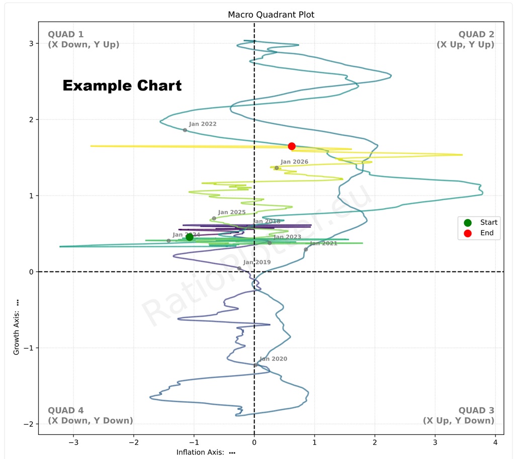
Macro Quadrant Trajectory Plot

Visualize chronological changes mapping rate of change for X-Axis (Typically Inflation) vs Y-Axis (Typically Growth) through the four major economic regimes.

Interpretation and strategic portfolio positioning: We do not provide investment advice, only educational and analytics tools and material. To understand the different charts, I advise you to read, ask experets, and ask AI about how a portfolio could be positioned for the different economic regimes from the quadrants above.

Maybe this prompt is useful as start: Regarding economic regime macro quadrant charts ploting the <substitute your x axis and y axis here: rate of change of inflation and growth>. Can you explain which assets are interesting to buy or sell on each quadrant and why? By quadrants I mean Q1, Q2, Q3, Q4 as defined above, with Q1 being y up, x down; and Q2 being y up and x up; and Q3 y down and x up; and Q4 being y down and x down? Do the quadrants have names for the specific x and y given?

We also add that there are two typical ways to position yourself regarding these quadrant transitions. One way is to position yourself for a momentum play, this is usually the case when for instance when one variable is already rising such as inflation and you trade to take advantage that it will continue to rise after all the acceleration is positive. Such a play could involve for instance buying commodities that readjust their prices for inflation (depends also on the economic growth trend). Another way is to position yourself is not on a momentum play, but on a mean reversal play, this is usually the case when the trajectory is likely to reverse to the mean and oscillate, cross to the other side of the x or y axis. For instance, inflation, and commodities may have started changing from negative acceleration to positive and you could position for a reversal by accumulating commodities at ever lower prices. Here the analysis of an overlay plot and how deep the lows in commodity prices could be useful, it is for instance interesting to buy cotton, sugar, oil below the production price for some countries.

Popular Trajectories

Trading Notes & Guide

Help & Notes

Z scaling, standardization: Feel free to remove the Z_SCALE call and see inflation acceleration not in the normal curve scale, but in the physics scale for acceleration points.

Common Start Date: The chart automatically finds the earliest date where all requested tickers have valid data (the intersection). Any data prior to this "Common Start" is trimmed to ensure a fair comparison.

Limit: The Free Tier is restricted to specific pre-defined baskets arguments for this chart, advanced users (subscribers) can enter any argument they wish, we use T-COM as a proxy for worldwide inflation.

Rate of change calculation: We use our regression based slope function on a window of past dates. We use 400 days for GDP as it is published less often, and we use 60 days for the commodity broad index T-COM. Feel free to adjust them to your needed timeframes.

Ticker Data Usage and Sourcing

Ticker Data Sources
Our data is provided from a variety of sources: The Federal Reserve (FED-* tickers), The World Bank (WB-* tickers), The International Monetary Fund (IMF-* tickers), Tiingo (T-* tickers covering: stocks, ETFs, etc), Ourselves (MATH-* tickers). The ticker data sources vary according to ticker prefix as you can see. Our ticker selector allows browsing each ticker and their description and placing them on a basket for use.
SEA() Ticker function
For ratio plotting, the SEA(Ticker) function can only be used in the denominator argument and only for plotting TickerA over SEA(TickerA) like this: T-CRUD/SEA(T-CRUD). The SEA() ticker function works by calculating the median yearly seasonality as a new dataset (see the seasonality page for details and examples of this calculation). This one year seasonality dataset is then unfolded exactly the same for many years and directly inputted as a synthetic ticker into this plotting page arguments. Example: Ratio plot of Crude Oil by its seasonality: T-CRUD/SEA(T-CRUD). To write custom SEA() function synthetic tickers simply input your ticker of choice between the parentheses such as SEA(T-CRUD).
RAT() Ticker function
The RAT() ticker function works by calculating the ratio between two tickers as a new dataset. This dataset is then directly inputted as an synthetic ticker into the plotting page arguments. To write custom RAT() tickers simply input your two tickers of choice between the parentheses, separating them with a comma. Such as RAT(T-AAPL, T-MSFT). This can only be once, synthetic tickers like RAT(RAT(T-AAPL, T-MSFT), SEA(T-qtec)) are invalid for the time being. Example, how is Google outpacing Microsoft in terms of CAGR curve: RAT(T-GOOGL,T-MSFT)/MATH-CAGR_PCT-2
LAG() Ticker function
The LAG() ticker function is used to create a lagged version of an asset. This lags a dataset with an amount of days equal to the lag value in the ticker. To write custom LAG() tickers simply input your ticker of choice and lag value between the parenthesis, seperated by a comma. Such as LAG(T-AAPL, 10). Lag values can only be inputted into the denominator as positive whole numbers between 1 and 7000 days. Using the ratio plotter with LAG(), a ticker can be analyzed in its auto correlation, or correlation to a nother ticker with a gap of X days (e.g.ratio plot of TICKERA by LAG(TICKERB, 30)).
MATH- Tickers
The MATH- tickers are custom mathematical tickers made by us (e.g. MATH-CAGR_PCT-2 for 2% exponential growth, MATH-CONST_VEC-1 for a constant value of 1 each day). To find the list of valid MATH tickers go to the Ticker Selector Page and search through the MATH category list. Important to mention is that when using the MATH tickers the last observed date for this MATH ticker will be far in te future.
CURVE_FROM_VECTOR()
The CURVE_FROM_VECTOR function allows transforming your own data vectors into plottable data. It is perhaps one of the most powerfull functions. As the name says, it creates a vector from user entered data points. This function is to be used when you cannot find the data you need in the ticker selector, or if your data is proprietary such as your own private company that you will plot against perhaps competitor's sales or a competitor's stock price. Learn using CURVE_FROM_VECTOR() here: price to x demo with CURVE_FROM_VECTOR() or on the details below. The price to x has an expression builder to require less typing from the user. Example usage: CURVE_FROM_VECTOR([198.27, 211.92, 245.12, 281.72, 318.27], '2026-06-30', 'last', '1y', 'linear', 'forward_fill') The first argument is the time ordered list of data points, separated by commas. The second argument ('2026-06-30') is the one data anchor we need to plot these values over time. The third argument ('last') tells the system to apply the anchor date to the last value, another value for this parameter is 'first'. The '1y' tells the values fall on the exact same date on each year (or closest if leap year). The '1y' could also be '1q' or '1m' for quarter or month. The same considerations made for year apply. The 'linear' parameter tells the system how to interpolate the values for days in between the value data points given, another possible value here is 'forward_fill'. The 'forward_fill' last parameter is about the extrapolation, its possible values are: 'none', 'forward_fill', 'linear'.
Default Ticker Column Projections & Adjustments
Let's take T-GOOGL as an example. When the projection variable is left blank, the ratio plotter will use the default projection variable which is -AdjClose (close price adjusted for both dividends and splits). This means that when you input T-GOOGL into the ratio plotter it will actually plot the "Tiingo split and dividend adjusted close price" of GOOGL: T-GOOGL-AdjClose (T-GOOGL-AdjClose by T-MSFT-AdjClose). If you want to plot the split (but not dividend) adjusted close price of GOOGL you can input T-GOOGL-SplitAdjClose. All projection columns are provided by Tiingo, with exception of the -SplitAdjClose column which is calculated by our system. For a complete explanation for beginners see our article: Understanding column projections.
Plotting Dividends Reinvested at Your Portfolio Return Rate
You can do this with the function: SIMUL_TICKER_DIV_REINVEST(T-MSFT,0.25,1,'2022-08-01')
This is a function available only for users with the advanced subscription. The first argument is the Ticker simulated, the second is your portfolio CAGR rate (in this case 0.25 = 25% yoy). We apply the daily equivalent rate though. The third argument is the initial investment in the currency of the stock ticker. The last argument is the start date. For a full example see our article on dividend reinvestment simulation or our article looking back at Warren Buffet's investment in Coca-Cola and the results of its juicy dividends.
Calculating slope, velocity, or derivating (these are all synonyms)
Let's say we to know how fast China is growing its GDP per day (GDP daily velocity). For this we can use the formula: ROLLING_SLOPE(IMF-NGDPD-CHN, 400, 1). The ticker is the IMF Chinese yearly GDP growth in billions of dollars, with revisions on a daily basis and with future forecasts also. The second argument 400 is the size of the lookback window in days to calculate the rolling, smoothed, slope. For GDP it has to be more than 365 days otherwise the GDP reviews cause the slope to not be smooth enough due to yearly GDP reviews, publishing. For other data such as stock prices you can have windows of 20, 30 days for instance. The number 1 shown as third argument implies we want to leave the slope at the granularity 1 which is growth per 1 day, or whether we want to perhaps to use an argument of 365 which will annualize the slope to the yearly growth velocity by multipling it by 365 (numbers smaller than 0 such as 0.001 are also allowed here). The value of this slope function for the IMF-NGDPD-CHN ticker is in billions of dollars GDP growth on per 1 day basis (if the last argument is 1). That always matches the ticker unit of measurement which in our case is in billions of dollars. Up to 2026, the best growth rates of China were 8 billion dollars per day, a staggering amount which seems to be stagnating lately. We can check these 9 billion dollar daily growth rates in this example of the ROLLING_SLOPE function: China GDP Velocity
Z scaling, bringing data to the normal curve Z score scale, normalizing
You can do this with the function: Z_SCALE. Examples: Z_SCALE(T-MSFT), Z_SCALE(RAT(T-GLD,T-SLV)), Z_SCALE(ROLLING_SLOPE(T-COM,90,1))
This is a function available only for users with the advanced subscription. The single argument can be a Ticker or another vector function. For a full example see our macro quadrant plot.