Introduction to Ticker Column Projections
I repeat in this paragraph the text explaining column projections from the cheat sheet located at the bottom of each of our plotter tools: Let's take T-AAPL as an example. When the projection column name is left blank, the ratio plotter will use the default projection variable which is -AdjClose (close price adjusted for both dividends and splits). This means that when you input T-AAPL into the ratio plotter it will actually plot the "Tiingo split and dividend adjusted close price" of AAPL: T-AAPL-AdjClose (T-AAPL-AdjClose by MATH-CONST_VEC-1). If you want to plot the split (but not dividend) adjusted close price of AAPL you can input T-AAPL-SplitAdjClose. All projection columns are provided by Tiingo, with the exception of the -SplitAdjClose column which is calculated by our ratioplotter.eu system.
Visualizing It All
The chart below is an overlay chart plotting the three valid ticker column projections for the GOOGL stock.
You can click this link for an updated chart (not sure why you'd want that):
Generate an updated chart
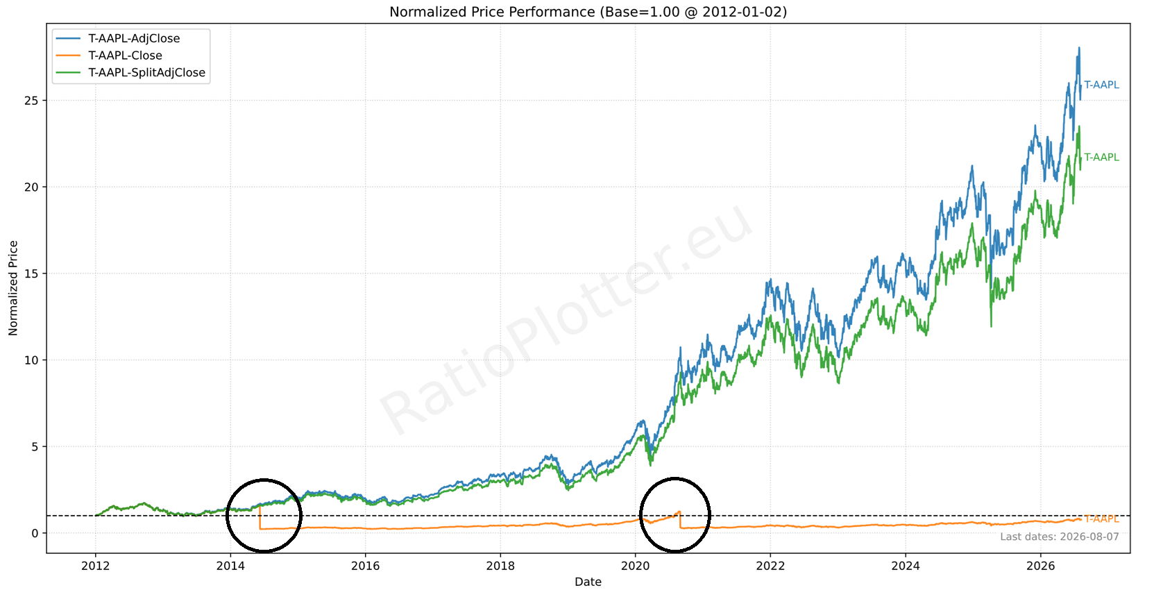
Let's explain each of the chart curves. To understand the chart above we need to focus on the two black circles which correspond to the two last stock split events for the Apple stock.
Apple's last stock splits (chart cut-off at article publication date):
- June 9, 2014: 7-for-1 split
- August 31, 2020 (market effective date / August 28 announcement): 4-for-1
Identifying the last two split events: As you can see, the black circles correspond to the last two stock split dates. On these dates the Orange curve (T-AAPL-Close) price drops exactly by the ratios of the stock split listed above. Meaning that by 2014 the Orange curve dropped to 1/7th of what its price was! And by 2020 it dropped to 1/4th of what it was.
What is a stock split?: For those who do not know stock splits the question that first gets asked is: why is this done? And the dissatisfaction behind the question may be: it pollutes the Orange line in the stock chart with sudden drops and makes it hard to compare this stock chart with others that did not have a split. It makes the Apple stock price in the Orange curve look like it lost value when it gained.
Stock splits are typically done to make the stock price affordable. The answer to this question of "why splitting the price" typically is: the split is done because the stock price was too high (say 1000$) and many retail investors could not afford to buy a single stock.
Such non-affordability is less of a problem today with platforms such as Trading 212 allowing fractional shares, which some perfectionists may say is the correct way to address the problem without spoiling the curve of the stock price.
The real end of day close prices curve is the Orange curve (T-AAPL-Close)! But almost nobody really uses it for analytics. The Orange price is the price you'd pay for the stock at any given day. But we are missing a curve which would tell how our investments would have grown. That is what the adjusted curves do (blue and green).
Explaining the blue curve without sudden price drops. For tracking the investment growth, our data provider (and many others) produce an alternative curve named here: T-AAPL-AdjClose (same as T-AAPL). Most analytics systems just plot this curve (T-AAPL-AdjClose = T-AAPL) when you ask for the AAPL ticker to be plotted.
Be careful though, the blue curve also takes into account the dividends by computing them as reinvested in the same stock that paid them, even though many investors do not reinvest the dividend on the same stock! If you want to simulate dividends reinvested at some other return rate see our article: simulating dividend reinvestment.
Whether it is right to split stock prices or not is beyond the scope of this article, the fact is that stocks are split. And to provide a smooth curve, most data providers calculate the blue curve which is the split (and dividend) adjusted curve. This curve is artificial; look at how the price of this curve was so much higher on the split dates, that blue price was not the price of Apple stock on that date. Such higher prices are a result of multiplying the Close price (orange curve) by the split factor as we move back from the current price to past prices and smooth the orange curve. The calculation is a bit more complex than explained as it also adds all paid dividends to the curve growth as explained above.
Why do the curves end at different prices on the right? Shouldn't they end at the same price value? Well, in reality, all three curves end at exactly the same price and you can test that using the ratio plotter tool to plot them individually. What is different on these curves are the prices before splits and the starting price. The illusion of different end prices is introduced by the overlay plot which forces all curves to start at 1 even though their prices on that date were surely different.
For those who do not want to assume dividends are reinvested in the smooth curve, we have two solutions which almost none of our competitors provide: (1) The green curve (T-AAPL-SplitAdjClose) which adjusts for the price split, but ignores completely the dividends. (2) The function to simulate dividends reinvested at a specific yearly return rate (say your portfolio return), for that see: simulating dividend reinvestment.
You may also be interested in our upcoming feature to estimate what the future dividend yields will be if the dividend payout keeps the same trend.