
The question on everyone's mind
Whether consciously or not, every investor has asked themselves the question of when to sell an old stock to make cash to buy a new one.
This question of "When should I sell stock A to buy stock B?" is exactly what we will be covering in this article. More commonly known as the art of Rebalancing.
Rebalancing means adjusting your portfolio by selling positions that may have become overweight and reallocating to opportunities with better risk-adjusted prospects.
When rebalancing in practice you always compare two stocks against eachother, but to keep this article readable we will only look at a hypothetical Stock A. So bear in mind that in practise, every analysis we will do Stock A, should also be done for Stock B!
A complicated decision
Deciding which stocks to buy or sell involves balancing multiple variables. Often, these factors point in conflicting directions. The art of rebalancing lies in evaluating the full picture and determining which direction is supported by the strongest evidence.
We will use various tools, for this article we have ordered the toolsfrom least to most important based on statistical evidence and our personal interpretation and experience.
But for you the appropriate weighting of these factors will depend on your investment horizon, risk tolerance, and whether you're seeking passive income or portfolio growth. Below you can see the order of importance we picked for this article.
Hierarchy of Evidence
🔴 Seasonality (Weakest, timing only)
🟠 Ratio Plots (Broad Market context)
🟡 Calculators (Fundamental expectations)
🟢 Fundamentals (Health and Growth verification)
In this article we will also show you how to gather and analyse this statistical evidence yourself, explaining how to plot the necessary graphs, which graphs there are and how to interpret them.
1. Seasonality Plotter
The Seasonality of a stock can give a small indication of whether you can expect any gain or loss within the analysed timeframe, which in this case is yearly. For this situation we will plot the seasonality of a hypothetical "Stock A".
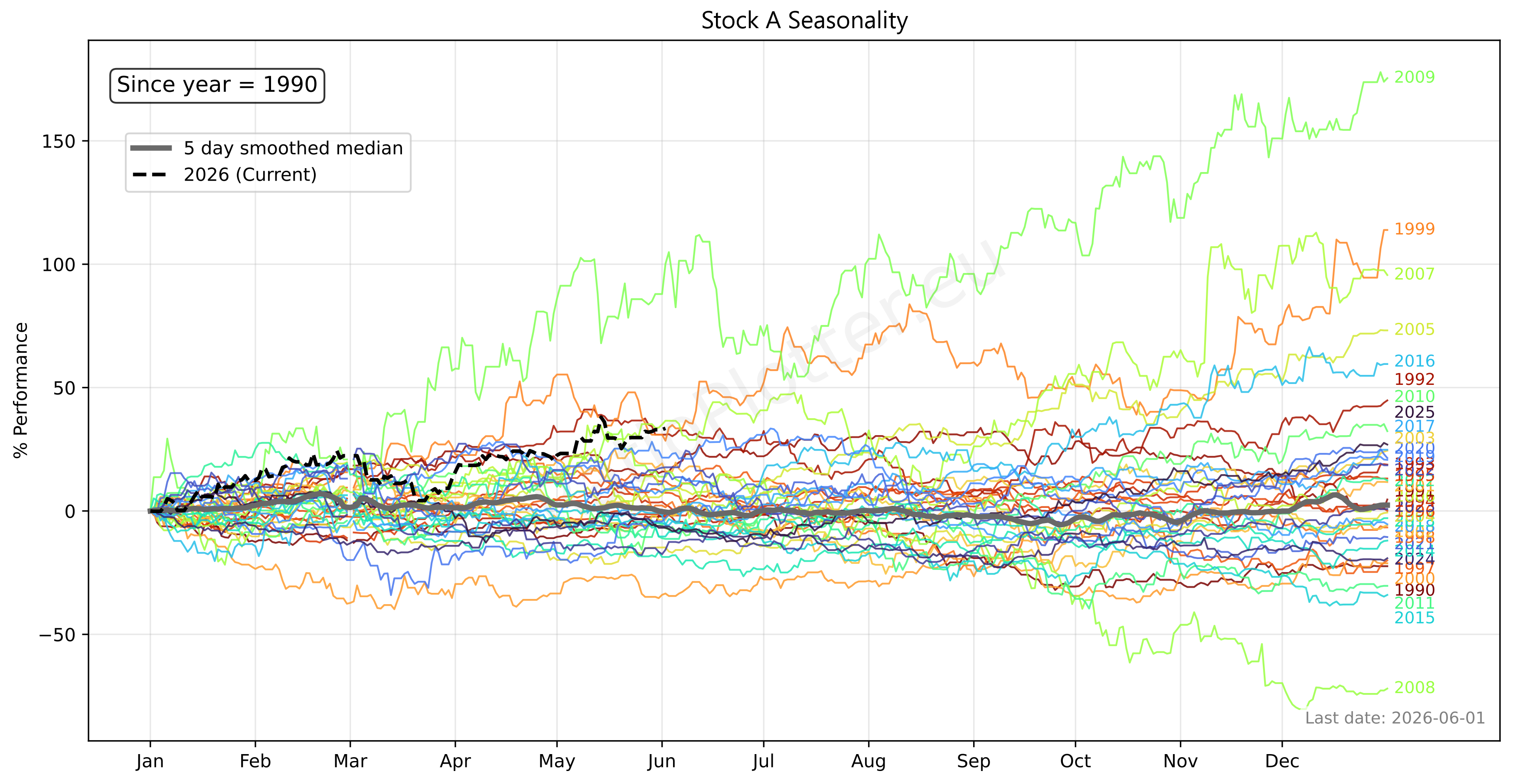
We can now see the performance of each year stacked on top of each other where each year starts at 0 and shows the % Performance on the y axis. The median value of all these years for each date is shown by the grey line. The black dotted line is the current year.
Although this chart alone is very interesting when looking at historical gains and losses per year, the median seasonality is not yet as useful as one may think. This is because often times the seasonality of a stock ends up being pure noise.
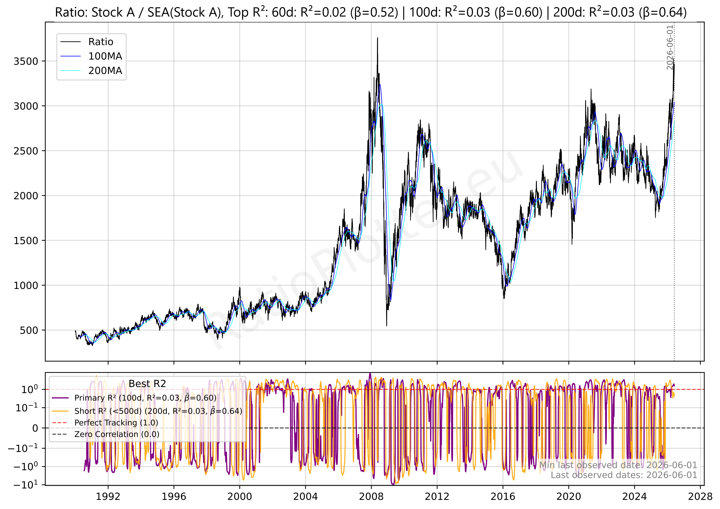
So how do we decide whether the seasonality is useful or just by chance? That is what the blue "Detrend ticker curve from seasonal effects using ratio plot" button on the Seasonality Plotter page is for. This button automatically tests the plotted seasonality's validity for you. When doing that we get the following chart.
Introduction
The chart you see above is the Ratio between Stock A and its Median Seasonality curve. What we have plotted now is assentially the stock's chart without seasonal effects. This can be seen as a new data series called the Seasonally Adjusted Price.
If the stock goes up exactly as much as its historical seasonality predicts, the ratio stays flat. Which isn't the case for Stock A.
Instead the ratio clearly has a swinging upward trend. When it moves down the stock is underperforming compared to its seasonal expectations and when the ratio moves up its outperforming its seasonal expectations.
Now you understand what both charts are it's time to explain how we will use the Stock A example charts above to explain when to use a seasonality signal to guide a potential sell or buy decision. We start by explaining the seasonality validity test and then we contrast the validated seasonality with the reality to show that the reality of this year's performance renders the seasonality signal weaker and calls for a broader analysis using other methods.
Seasonality Validity Test
When validating the Seasonal effects of a stock the R2 and Beta are the most important factors.
The Beta measures how much an asset moves relative to a benchmark. Where in the seasonality validation chart the benchmark is the stock itself and the asset is the seasonality of that stock.
We use the R2 as a measure of correlation between Asset A (Stock A) and Asset B (The seasonality of Stock A). Where the value for R2 represents the percentage of variance in one asset that can be mathematically explained by the other.
As you can see the seasonality validity test gives us a Top R2 value of 0.03 for the 200 day rolling window.
This tells us that over a 200-day window, only 3% of the stock's price movement can be explained by its seasonality. This is a very low value, indicating that the seasonality of Stock A is not a strong predictor of its price movements.
For this same 200-day rolling window we get a Beta of 0.64.
This tells us that over a 200-day window, when the denomirator (The seasonality of Stock A) moves up 10% the numerator (Stock A) will move up 6.4%!
But what these indicators don't do is predict directional price action. To determine the historical directional bias for this time period, we must refer back to the base seasonality chart.
The Seasonality Signal
The original seasonality chart shows that we are currently on the 1st of June 2026. Here we can not only see that this year Stock A has outperformed it's median (see the black dotted line compared to the grey median line) but that the median also makes a local top around the 24th-25th.
Furthermore when we look forward 200 days from the 24th of April we end up on the 18th of December 2026. When you take a close look at that date you can see that on the median line there is an expected % growth of around 5-10% from now until then with a sharp drop from the 18th-24th of December. Concidering that the R2 is only 3% we can conclude that the seasonal uptrend is weak and there are little to no gains to be made here based on just seasonal evidence.
The Reality
When we now look at the black dotted line we see that the current year has the 3rd highest gain stock A has ever made at this time of the year (1st of June) since January 1st.
Now when we look at the end of December we can see that the median yearly gain is barely above zero. Meaning that this year the stock has already drastically outperformed it's median and the expected 200-day performance.
Seasonal Conclusion
When taking these facts that the realised performance this year is already significantly higher than the expected performance in the next 200 days and the rest of the year, one could only conclude that this hypothetical Stock A would not be worth it to hold any longer based on the seasonal signal.
But this raises the question of when you should use the seasonality as a potential signal to buy. For this we simply need to flip the logic. For example: if a high real gain and a low expected gain gives us a potential sell signal, then a loss for a current year compared to a strong median seasonal gain paired with a good beta for the next x days would give us a potential buy signal!
But this is only one side of the story, and such a result doesn't call for a sell, instead it calls for further analysis of other signals.
For example by examining the seasonality of stock B, for which the same seasonality analysis should of course be done! For brevity, the seasonality analysis for Stock B has been omitted.
But even better would be to do another analysis besides seasonality, that is why we will move on to the second factor to further understand which stock is better. For this we need to continue with the Ratio Plotter.
2. Ratio Plotter
The Ratio Plotter can be used in endless different ways when comparing two stocks. A few examples are:
1. The ratio between each stock and their country's market index/etf.
2. The ratio between each stock and their country's GDP.
3. The ratio between each stock and their sector etf.
4. When both stocks are in the same sector, the ratio between the stocks themselves.
5. When a stock import or exports a major commodity the ratio between the stock and that commodity.
6. When a stock is largely held by another public company, the ratio between those two stocks.
In this article we will cover only the first ratio plot for Stock A, explaining how to read that chart and how to use that knowledge to also read the other ratio plots for Stock A and the plots you would typically make for Stock B.
To plot the ratio between a stock and its respective country's market we first need to find the correct country ticker, this can simply be done by finding the country in which the stock is listed. For our hypothetical Stock A this is the London Stock Exchange, meaning our respective country is the United Kingdom.
For the United Kingdom there are two possible tickers, either the FTSE 100 or the FTSE All-Share. Important to note is that both the stock and its country's index must be in the same currency for accurate results, so make sure this is the case when putting this into practise!
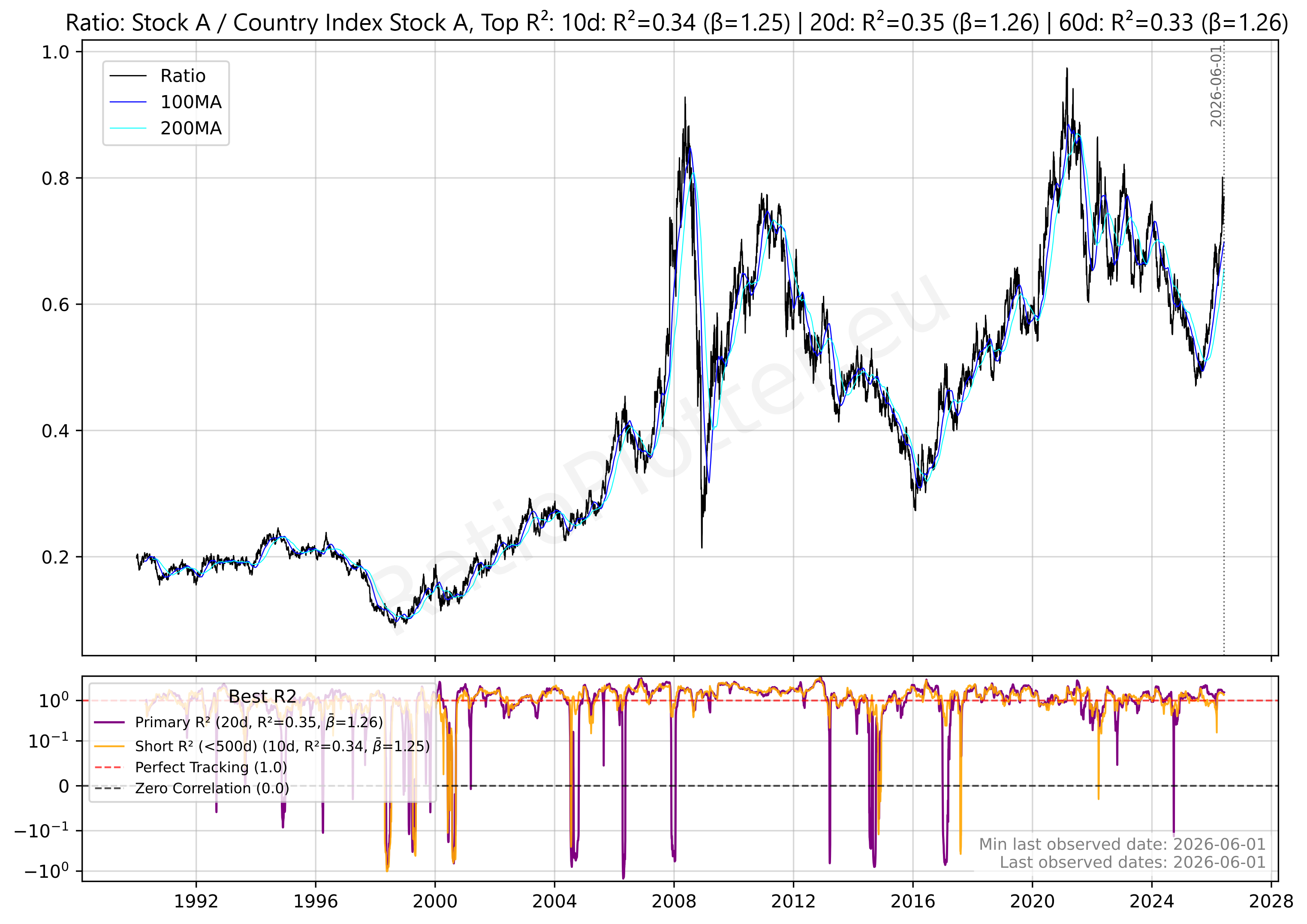
When looking at this chart the first thing you should notice is the long term upwards trend. This means that Stock A outperforms its country's market index. The second thing you might notice is the very high Top R2 values of 10d: 0.34, 20d: 0.35 and 60d: 0.33. Paired together with the three very high betas, these being 10d: 1.25, 20d: 1.26 and 60d: 1.26.
These betas and R2 indicate this stock is heavily influenced by its home market. Roughly 34% of the stocks movement can be attributed to seasonal effects. Furthermore, the high betas mean that when its home market moves up 10% it moves up 12.5%-12.6% signaling above average performance against its home market. Another long term observation we can make is that the purple and yellow rolling betas are very stable and don't often deviate from their averages, signalling a strong link between Stock A and its home country's index that almost never deviates.
Now for the short term analysis, taking a closer look at the last 1.5 years we can see a sharp recovery of the Ratio from its bottom in the end of 2025. Indicating the stock has been priced at a premium compared to its respective country's index. When you notice a sharp change like this it can mean one of four things:
1. Stock A gained while the index stayed flat
2. The index dropped while Stock A stayed flat
3. Both Stock A and the Index gained but Stock A gained more
4. Both the index and Stock A dropped but the index dropped more
This is where you need to check the charts for just the index and Stock A on their own to check their performance.
You can do this by plotting the ratio of a ticker to MATH-CONST_VEC-1 (This is a mathematical constant vector used to isolate a single ticker). This way you can see just the chart for that stock or index.
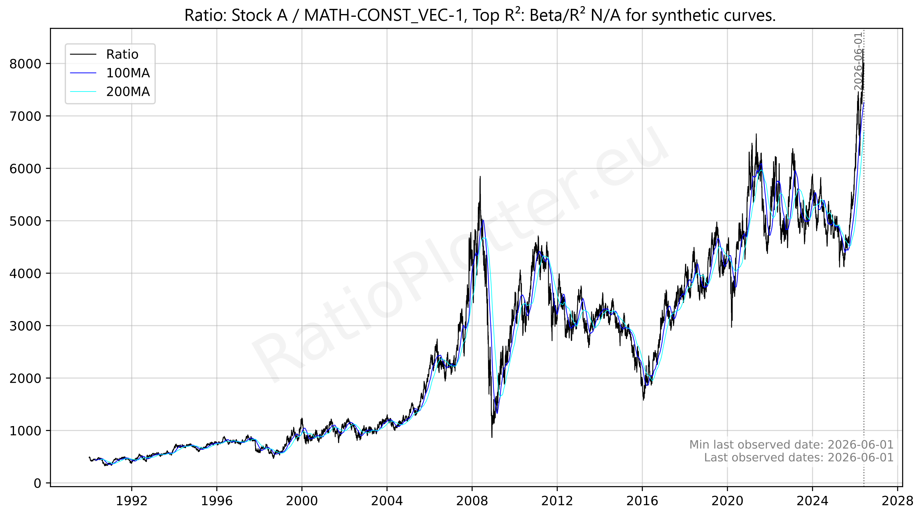
When we do this for both Stock A and the index we can see that both have actually gone up since the bottom of the Ratio, meaning we are in scenario 3 above. This means that although Stock A is outperforming its home country's index it is doing so within a 'rising tide' environment. This indicates that the stock isn't just winning on its own merits, but is also riding a wave of broad market optimism. In this scenario, the stock acts as a high-beta leader: when the market feels confident and buys the index, most investors feel extra confident in Stock A, pushing it even higher. While this confirms the stock's momentum, it also means your gains are partially dependent on the overal market's health remaining intact.
For the other scenarios you can reference this table as a guide, although actual market sentiment is often way more nuanced than a simple table could describe.
| Scenario | Movement | Market Sentiment |
|---|---|---|
| 1. Stock Up / Index Flat | Idiosyncratic Strength | Neutral. The market is boring, but this specific company has a "secret sauce" or news catalyst. |
| 2. Stock Flat / Index Down | Defensive Moat | Fearful. The market is retreating, but investors are using this stock as a "bunker" to preserve capital. |
| 3. Both Gaining | Bullish Momentum | Greedy/Confident. Everything is moving up, and your stock is the leader of the pack. |
| 4. Both Dropping | Relative Resilience | Panic. The house is on fire, but your room (Stock A) is burning slower than the rest of the building. |
Ratio Plotter Conclusion:
In conclusion we can defer two main factors from our analysis using the Ratio Plotter. The first being that the high tide caused by broader market optimism is making the growth of Stock A look higher then it maybe should be. And the second is that the performance of Stock A is highly tied to the general market, which could tell investors that this stock is one to avoid when the markets themselves are at all time highs without the earnings to back the prices up.
Now it's time to take a closer look at the expected growth of Stock A on its own. We can do this using Financial Calculators, of which there are three main flavours; Sales Growth Calculators, Dividend Yield Calculators and CAGR Calculators.
3. Sales, Dividend and CAGR Calculators
The Financial Calculators on RatioPlotter.eu can be used to quickly determine basic stock growth by simply pasting in data from your preferred financial data website.
We will be using these calculators to set a few reality check values for Stock A, these values will to determine if all other factors are in our out of proportion. This will help us quickly determine if a stock is over- or undervalued.
A. Sales Growth Calculator
To calculate the expected yearly growth of a company we can use a simple sales growth calculator as a reference to compare with the real gain.
Our Sales Calculator at RatioPlotter.eu uses a simple sales growth series to calculate the average yearly revenue gain. For Stock A this calculation came down to:
0.80% average YoY growth for the last 15 years
7.05% average YoY growth for the last 10 years
-2.13% average YoY growth for the last 5 years
3.35% average YoY growth for the last 3 years
and 7.42% average YoY growth for the last 2 years
Noticable is that the sales growth of Stock A is very incosistent.
For all 15 years the highest YoY (Year-over-Year) growth was 42.33% while the biggest YoY drop was -26.93%.
This can signal a highly cyclical business or a company that is sensitive to external economic shocks. Such wide swings suggest that while the Stock A can capture massive upside during boom years, it lacks a consistent 'defensive floor,' making it a higher-risk candidate for long-term forecasting.
To dive deeper into this risk of a consistent floor we can compare the Sales Growth of Stock A to the price gain over the last year, which has been over 58.74%! This can indicate a significant valuation expansion where the stock price has decoupled from its underlying business fundamentals. When actual stock gains (58.74%) outpace the most recent Sales growth (7.42%) by such a wide margin, it suggests that the market is paying a massive premium for future potential, or that investors are caught up in momentum-driven greed. While this is great for current holders, it signals that the stock may be 'overextended' and vulnerable to a sharp correction if the company's sales don't eventually catch up to the hype.
For our CAGR (Compound Annual Growth Rate) calculation, we will use the 3-year average sales growth of 3.35%. We chose this timeframe because it strikes the best balance: it is recent enough to reflect the company's current recovery phase, yet long enough to filter out the 'noise' of a single outlier year.
B. Dividend Calculator
When doing the dividend calculation we simply input a series of past dividends to get the average yearly dividend yield, current dividend yield and the adjusted dividend yield.
The adjusted dividend yield is what we will be using for our CAGR (Compound Anual Growth Rate) calculation later on. For Stock A the calculation came down to:
6.28%Past Average Dividend Yield
4.08%Current Dividend Yield
6.28%Adjusted Dividend Yield
Something noteworthy is that the Adjusted Dividend Yield is the same as the Past Average Dividend Yield. This is because we are assuming that when the Current Dividend Yield is below average it will return to its historic values after some time.
C. CAGR Calculator
The CAGR Calculator works by combining the Sales Growth and Adjusted Dividend Yield into an expected yearly return an investor can expect from a stock.
If you combine the 3.35% sales growth and 6.28% Adjusted Dividend Yield we get a expected CAGR of roughly 9.5% for the next year. (Important to note is that this is a simplified approximation and doesn't account for valuation changes, buybacks, or reinvestment rates.)
When comparing two stocks, we can perform these same calculations for Stock B to identify the superior play. Ideally, Stock B would have a lesser valuation extension, paired with a CAGR that's higher than Stock A.
However, a growing company isn't always a healthy one. To ensure we aren't buying into a "value trap" we must look beyond growth and verify the company's internal strength. We can do this by analyzing Financial Fundamentals to determine if the stock's foundation is as solid as it's performance suggests.
4. Financial Fundamentals
Financial Fundamentals are basic ratios, percentages, and metrics that can tell you crucial things about a company's financial health, spending habits, operational efficiency, and overall valuation. By examining these numbers, investors can look past the hype and evaluate the underlying strength of a business.
Current Ratio:
The first of these Financial Fundamentals we will look at is the Current Ratio. This is the ratio between a company's current assets and current liabilities. Generally, we are looking for a value above 1.0. This indicates that the company can easily pay back its short-term debt using its liquid resources, showing the company has trust in its ability to maintain a healthy "liquidity buffer" for daily operations. However, there is a "Goldilocks" zone to consider: if this ratio is too high—for instance, 4.0 or 5.0, it can actually be a red flag. While it looks safe on paper, a very high ratio often suggests the company is sitting on too much idle cash and isn't "putting its money to work" by reinvesting in its own growth or future expansion. Comparing the current ratios between multiple stocks within the same sector can make the healthy companies pop out without much work.
For Stock A the current ratio currently is at a steady 1.45 signalling a nice cash buffer without signalling it's being afraid to invest in itself.
Price to Book:
The second Financial Fundamental we will look at is the Price to Book. This is the ratio between a company's market capitalization (its total stock market value) and its book value (its total assets minus total liabilities). Essentially, it tells you how much the market is willing to pay for every dollar of the company's net worth. A lower P/B ratio (typically under 1.0) can indicate that the stock is undervalued or that the market suspects underlying issues with the business. Conversely, a higher ratio means investors are paying a premium, often because they expect significant future growth or strong returns on equity.
The Price to Book for Stock A sits at 2.59, signalling an overvaluation.
Profit Margin:
The third Financial Fundamental we will look at is the Profit Margin. This is a measure of a company's profitability, calculated by finding the percentage of total revenue that remains as profit after all business expenses, taxes, and costs have been paid. It essentially shows how efficiently a company converts its sales into actual cash in the bank. While a higher profit margin is always preferred, it is crucial to only compare the profit margins of stocks within the same sector, as baseline margins vary wildly between different industries.
With a Profit Margin of 17.29% in combination with the 7.42% sales growth the last year its clear why the recent gains have been so high.
Price to Earnings:
The fourth Financial Fundamental we will look at is the Price to Earnings ratio, commonly known as P/E. This is the ratio between a company's current share price and its earnings per share (EPS). In short, it tells you how much investors are willing to pay for one dollar of the company's current earnings. A high P/E ratio generally suggests that investors expect high future growth, but it can also mean the stock is currently overvalued. Conversely, a low P/E might indicate that the stock is undervalued, or that the company is facing underlying struggles. Just like profit margins, P/E ratios should always be compared against industry peers.
Stock A currently trades at a P/E of roughly 16. The inverse of this is 6.25% meaning that with its 4.08% Current Dividend Yield this company is currently paying out approximately 65% of its profit as dividends. So investors aren't just paying for future growth; they are paying a premium for immediate, heavy cash flow from the dividends. Additionally, Stock A is highly cyclical as we saw from the Seasonality and Sales Growth calculations. For cyclical stocks, P/E ratios can be deceptive: a high P/E often occurs at the bottom of a business cycle when earnings are temporarily depressed. Looking at the past two years and the current Price to Earnings: 8.93 → 12.75 → 16.19, and its Earnings per Share: 6.8 → 6.7 → 6.7, we can see that this is indeed the case. The earnings have stayed stable while the stock price has gained. Indicating investors expect a cyclical recovery and are increasingly willing to pay a premium for future growth that has yet to manifest in the company's current earnings.
But these values highlight something else... If the company's EPS stayed flat at ~6.7 and the P/E rose from 8.93 to 16.19, the stock price must have went from ~$60 to ~$108. That's an 80% price gain with 0% earnings growth. This is a massive valuation expansion that should ring all the alarmbells in your head.
Price to Sales:
The final Financial Fundamental we will cover here is the Price to Sales ratio, or P/S. This compares a company's market capitalization to its total revenue over the past 12 months, showing how much the market values every dollar of the company's sales. This metric is especially useful for evaluating younger, fast-growing companies that might not be turning a net profit yet, but are generating massive revenue. Generally, a lower P/S ratio implies that the stock is a more attractive investment, as you are paying less for every unit of sales the company generates.
Stock A currently has a Price to Sales ratio of 2.80. This means you are paying $2.80 for every dollar of revenue Stock A will make the coming year. When combined with the Profit Margin of 17.29%, it shows that the valuation math for Stock A is internally consistent. The strong margins explain why the market assigns a premium P/S, but it does not mean the stock is inexpensive. Rather, it confirms that investors are paying a steep price for every dollar of sales, and the company must maintain those strong margins to keep that premium alive. Should profits disappoint, the price could drop back toward more typical levels even if revenue itself holds steady.
All Together Now:
These are only five of the endless Financial Fundamentals out there; therefore, we suggest you do your own research to find the most applicable fundamentals for each stock to make sure your analysis is accurate.
When looking at just these five fundamentals, it becomes clear that no single metric tells the whole story.
A 1.45 current ratio makes the stock look like a safe bet, especially when paired with a 17.29% profit margin. But when combined with a 2.59 Price to Book, a Price to Earnings ratio of 16 and a Price to Sales of 2.80, you might be buying into a highly overvalued stock.
These mixed signals from the Financial Fundamentals call for a reflection back to our previous analysis with other tools, by linking the Fundamentals to these charts we can find the reason why the signals are mixed and find the hidden truth. For example, the 2.59 Price to Book and rising 16 P/E are the mathematical manifestations of the valuation expansion we identified earlier: that massive 58.74% actual gain versus the 7.42% sales growth for the last two years.
The Ratio Plotter provides the "why" behind this premium; because Stock A is a leader in a "rising tide" environment, market-wide optimism has inflated its multiples (like the 2.80 P/S and P/E of 16) beyond what its 3.35% average sales growth would typically justify.
Finally, the Seasonality Plot acts as the ultimate reality check. It shows the stock is at a local top and has already exhausted its median yearly gains. This suggest that these high fundamental ratios aren't just signs of growth, but indicators that the stock is currently overextended and priced for a perfection it has yet to deliver.
Conclusion
In short, the art of rebalancing your portfolio should never be left to gut feeling. As we've seen, it requires building a case against both stocks, using a step by step evidence guided approach diving deeper on each uncertainty or vague answer until we have a full picture of a stock's value.
By layering our analysis, we moved from the timing clues of Seasonality to the broader market context of Ratio Plots. Then we grounded our expectations with the Financial Calculators and finally verified the company's underlying health using Financial Fundamentals.
While Stock A's massive recent gains might feel like a reason to blindly hold, our deeper dive reveals a stock whose actual growth has dangerously outrun its expected growth, paired with a seasonal trend pointing to a slowdown.
This makes the rebalancing of this hypothetical Stock A to a safer and undervalued Stock B a highly attractive option.
When the combined weight of these statistical tools and financial metrics points in a definitive direction, you ensure you aren't just chasing hype, but continuously optimizing your portfolio for the best risk-adjusted returns with absolute conviction.
Now we can finally answer the original question this article said it would; "When should we sell Stock A to buy Stock B?"
The simplest answer is to buy the stock for which the most postive evidence was found and to sell the stock for which the most negative evidence was found
An analogy that can you you visualise this is by seeing it as a kind of net force calculation. Where each new piece of evidence represented as a force vector. By viewing the whole picture as a system of vectors. We can multiply each factor's importance by its directional bias. This lets us calculate a net force which gives us the answer of which stock we should sell and which we should buy.
Consequently, this tells us that a small number of 'strong' vectors for Stock B might be equalized by a multitude of 'weak' vectors pulling toward Stock A. Which is very true as often there is a lot of contradicting evidence when evaluating stocks.
Now that you've learned the theory it's time to put it to the test.
Pick an old position you've been thinking about selling for a while and compare it to a new stock to find what's best.
Ready to put your own portfolio to the test? You can find the Seasonality Plotter here, the Ratio Plotter here and the Financial Calculators here.
This article is for educational purposes only and does not constitute financial advice. Past performance does not guarantee future results. Always conduct your own research or consult a qualified financial advisor before making investment decisions.