Ratio Plotter Interpretation: Copper vs Gold
One of these indicator ratio's is the Copper/Gold ratio. See this article from Reuters on what this ratio means.
When you read an article such as the one above, the most common issue is that the information used is already outdated by the time you read it. In the time between when the article was written and when you read it the ratio in question may already have changed drastically.
So to turn this new knowledge about this indicator ratio into actionable insights you need to plot the ratio yourself. Here is where our tool comes in, a free to use plotter where you can turn these articles into real investing insights.
1. Visualizing the "Economic Doctor"
Our tool allows you to plot the ratio of two tickers instantly. To replicate the analysis in the Reuters article, you would input the numerator as Copper (T-CPER) and the denominator as Gold (T-GLD). Our program then divides the price of copper by the price of gold for every day in the data range.
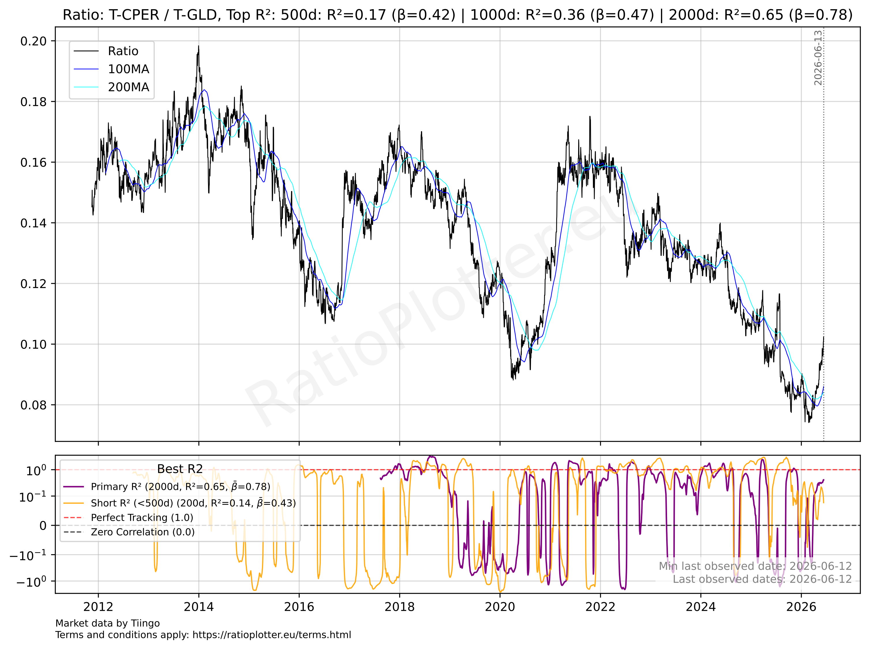 For the up to date chart click here
Ratio = Price of Copper / Price of Gold
It will then generate a chart like the example chart shown above, from which the insights can be extracted.
Why this works: Copper is often called "Dr. Copper" because it has a PhD in economics—it rises when global growth and industrial demand are strong. Gold is the safe haven. When this ratio rises, it signals global reflation and growth. When it falls, it signals economic slowdown and fear.
2. Spotting the Yield Divergence
The real value in knowing the Copper/Gold ratio isn't just seeing the ratio, it's seeing how it compares with the 10-Year Treasury Yield (TNX).
Pattern: Historically, this ratio moves in lockstep with interest rates. If you see the Copper/Gold ratio falling (or staying flat) while the 10-Year Yield is skyrocketing, you have found a Divergence. As the Reuters article notes, this relationship may be "bent" (temporarily disconnected due to geopolitics or supply shocks) but it is rarely "broken." Eventually, they must converge.
3. Strategy
An article can tell you the correlation is stressed, but it won't tell you when the snap-back will occur. For this you can use our tool to look for realignment.
As the article suggests, if the ratio remains disconnected from yields for too long, a mean reversion is likely. By using our tool to overlay the ratio against the 10-year yield, you can spot the turning point.
Scenario: If the Copper/Gold ratio starts to break higher to "catch up" to high yields, one might rotate into cyclical commodities and industrial miners. Conversely, if yields start to crash down to meet a depressed Copper/Gold ratio, it signals a bond rally (lower rates), suggesting a move into long-duration treasuries (TLT).