
Ratio Plotter Interpretation: Gold vs Platinum
One of these indicator ratio's is the Gold/Platinum ratio. See this article from Marketwatch on what this ratio means.
When you read an article such as the one above, the most common issue is that the information used is already outdated by the time you read it. In the time between when the article was written and when you read it the ratio in question may already have changed drastically.
So to turn this new knowledge about this indicator ratio into actionable insights you need to plot the ratio yourself. Here is where our tool comes in, a free to use plotter where you can turn these articles into real investing insights.
1. Visualizing the "Geopolitical Pulse"
Our tool allows you to plot the ratio of two tickers instantly. To replicate the analysis in the MarketWatch article, you would input the numerator as Gold (T-SGOL) and the denominator as Platinum (T-PPLT). Our program then divides the price of gold by the price of platinum for every day in the data range.
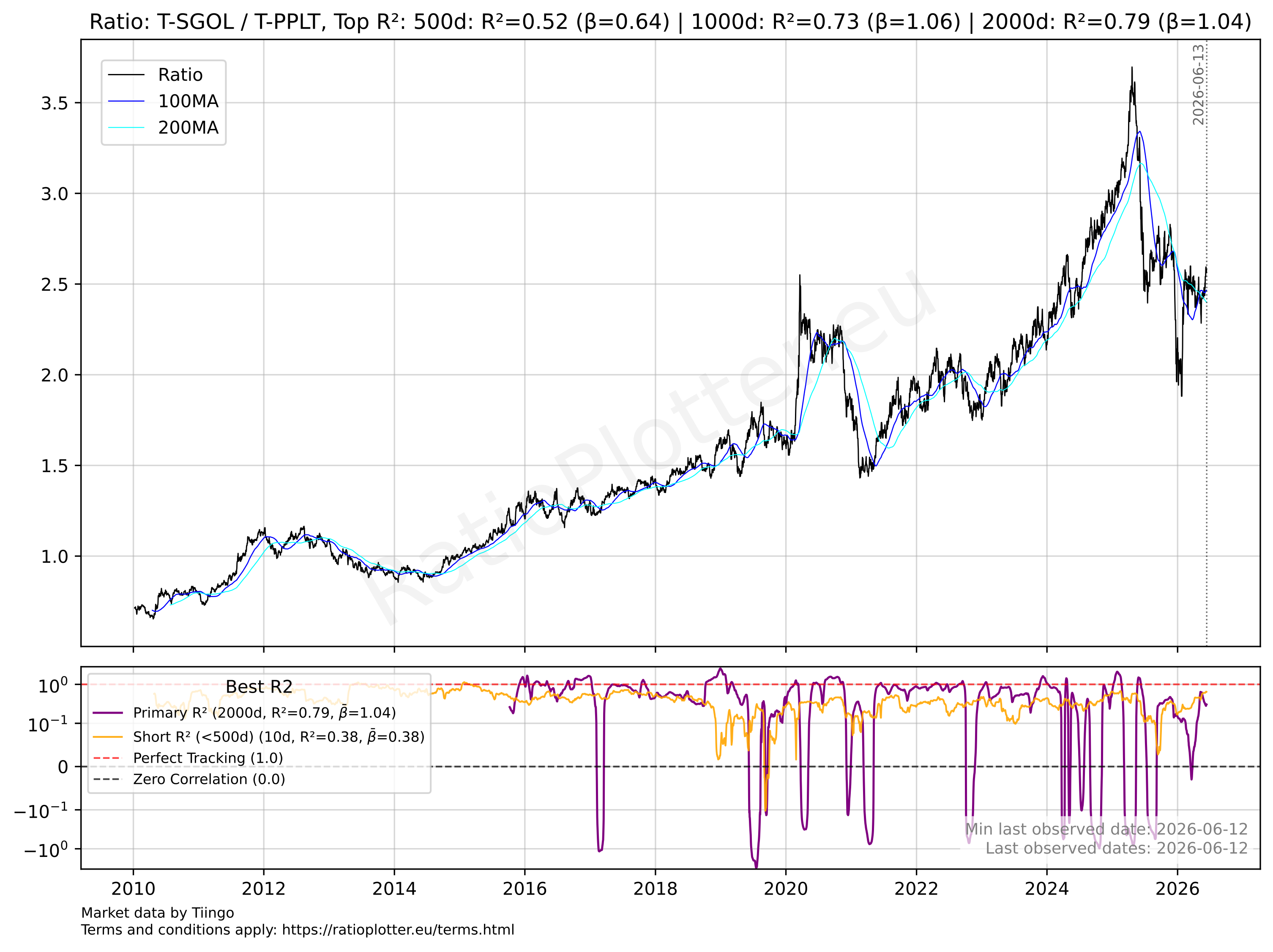 For the up to date chart click here
Ratio = Price of Gold / Price of Platinum
It will then generate a chart like the example chart shown above, from which the insights can be extracted.
Why this works: Gold is the ultimate "crisis" asset, whereas Platinum is a workhorse for the global economy (used heavily in the automotive and industrial sectors). When the ratio falls, it signals that investors are no longer willing to pay a premium for "geopolitical insurance."
2. Spotting the Bearish Divergence
The real value in knowing the Gold/Platinum ratio isn't just seeing the ratio, it's seeing how it compares with the S&P 500 (SPY).
Pattern: If you see the Gold/Platinum ratio making Lower Lows while the S&P500 is making Higher Highs, you have found a Bearish Divergence. This suggests that the stock market is "flying blind". It's hitting new highs even as the underlying risk premium (the safety net) is being pulled away.
3. Strategy
An article can tell you the market might fall 16%, but it won't tell you when to pull the trigger. For this you can use our tool to look for stabilization.
As Hulbert noted in the MarketWatch article, the ratio didn't rebound after its summer plunge. By using our tool to monitor the Moving Averages of the ratio, you can identify the exact moment the trend shifts from a "temporary dip" to a "long-term regime change."
Scenario: If the ratio remains depressed and breaks its 200-day moving average, one might look to reduce exposure to high-beta tech stocks and rotate into defensive sectors or increase cash reserves to prepare for the predicted 12-month correction.