
Plot Seasonality for Ticker
Enter one financial asset ticker (e.g. GLD)
Popular Tickers
Legend:
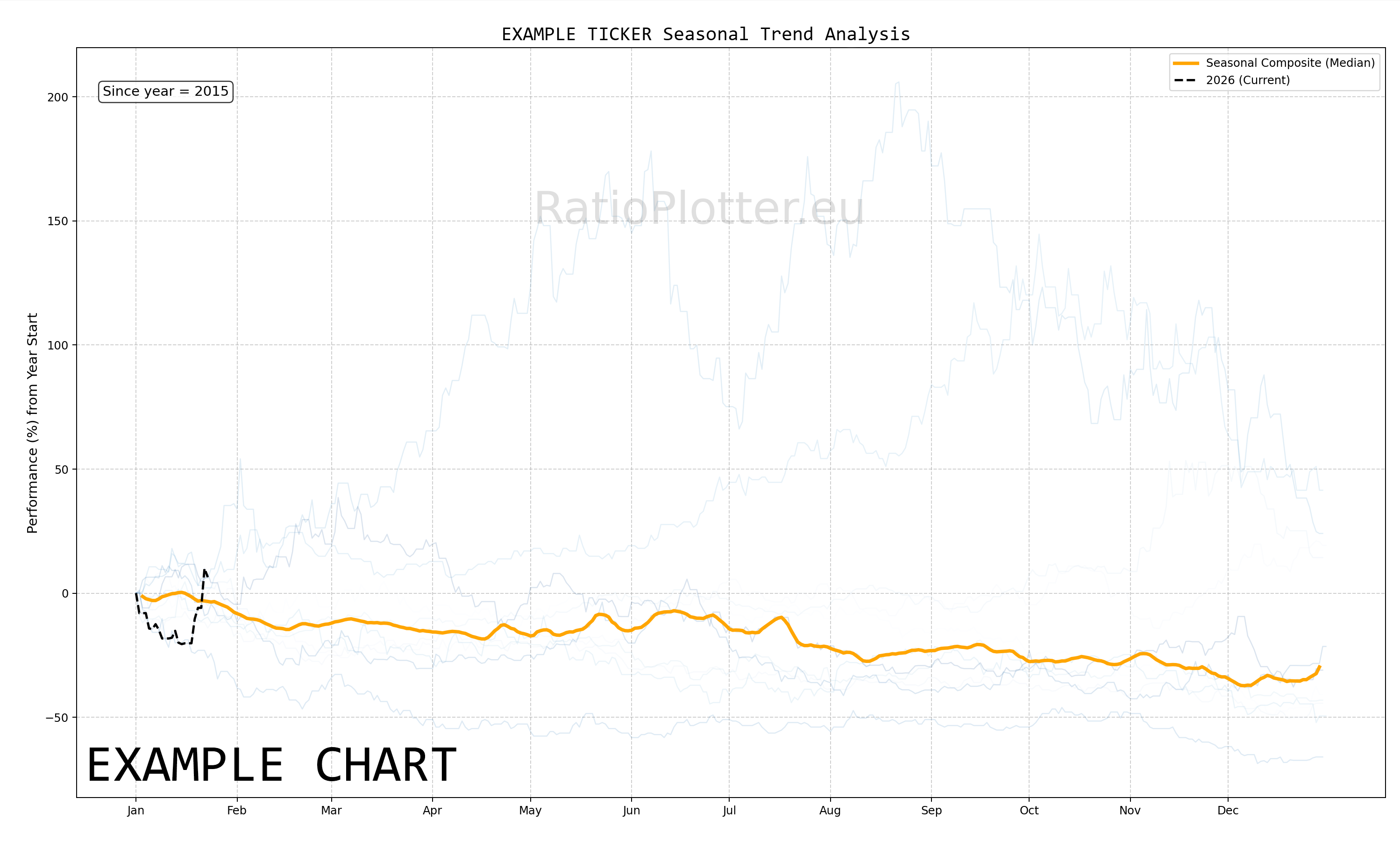
- Colored lines (Normalized YTD): One line is shown for each historical year; the year lines are coloured in the sequence of the rainbow hues. This implements Normalized YTD logic by finding the first valid price of the year (usually Jan 1st) and recalculating the rest of that year as a percentage deviation from that start price.
- Thick gray line (Composite): This is a robust aggregation of the coloured lines using the median rather than the mean. Why median? If one year had a massive 50% crash in March, the Median line will ignore it, whereas an Average line would drag the whole seasonal chart down, giving you a false bearish signal.
- Black dotted line: This represents the current year. It is vital for seeing where the current price is trading relative to historical trends.
Tips, caution notes
- Is it seasonality or is it noise/chance?: To find out, 1. Plot the seasonality for a ticker. 2. A yellow button appears below the chart, click the yellow button to detrend the ticker from its seasonality and watch the betas in between the ticker and its seasonality curve. See target page on how to interpret the betas, high magnitude betas indicate the seasonality is not by chance.
- Recommendation: Check the ratio plot of your ticker against a baseline ticker that has a beta correlation with it. The seasonality may look appropriate, but your ticker agains its country ETF or similar may paint the opposite picture.