Logarithmic Regression Builder
Construct custom logarithmic extractions and view trend-line residuals.
The y=LOG(A)-LOG(B) Model (Constrained / Ratio Spread)
The y=LOG(A) Model (Log Linear Time Trend)
Log Plots (Free Demos and Paid)
More Ideas for LOG or REGRESSION plots & Rankings
For more ideas of LOG or REGRESSION plots: (1) click a ratio plot idea on the ratio plot page , and then (2) Click the Salmon coloured button below the ratio plot with the text: LOG(tickera)-LOG(tickerb) or click the button REGRESSION(LOG(tickera)-LOG(tickerb)). These buttons will return you here. Or simply build your own plot below with use of the ticker basket.
For the best constrained ratio regressions and log linear regressions rank see:: Insights on Constrained Ratio Spread Regressions and Log Linear Regressions.
Trading Notes & Guide
General Notes
Currency Consistency: Ensure tickers are in the same currency to avoid exchange rate noise affecting the ratio.
See the currency on the Ticker Selector Page.
ETF Consistency: When plotting the ratio between two ETF's, always check that both are either distributing or accumulating. If this is not the case dividends can effect the results significantly!
R2 and ADF p: Ensure the R2 and ADF p point to a good quality model which can be used for trading (see table below).
Recommendation: Always check the seasonality plot of the ticker you intend to swing trade; ensure the historical seasonality isn't moving against your position.
Why Log Plots Often Beat Ratio Plots for Trading/Investing?
Financial asset prices, in the long term, typically behave in an exponential manner. This exponential behaviour can eliminated by ratio plotting for instance the T-VOO ticker divided by an 8% compound annual growth per year curve: RAT(T-VOO, MATH-CAGR_PCT-8). This exponential behaviour means our typical asset doubles in price every x years (if they are doing what an asset is supposed to do and not going bankrupt).
The problem with the above division by an exponential curve above is that assumes the asset keeps same average CAGR, compound rate pear year throughout its price history. Which is often not true.
By applying the LOG() function to such prices, we bring them to a scale where doubling from 0.5 to 1, covers the same distance on the y axis as doubling from 2 to 4. Notice that on a regular plot of T-URTH for instance, a price climb from 0.5 to 1 has distance 0.5 on the y axis, and notice that a price climb from 2 to 4 has distance 2 on the y axis (price axis). But on the LOG(T-URTH) chart, both price climbs have the same distance! If you want to work out the numbers, we have: climb 1: LOG(0.5,2)=-1 and LOG(1,2)=0, distance 1. And for climb 2: LOG(2,2)=1 LOG(4,2)=2, distance 1. In the LOG(CURVE) chart, an exponential curve looks like a diagonal line. The stronger the exponential, the steeper the diagonal line. With the advantage that such line can be used for a linear regression model, it can be fit to an average price line with intercept and coefficient for how steep it climbs the price up.
Moreover, if you are using the ratio plotter instead of the log plotter for trading, you will have the following problems: (1) On the ratio plot, there are distortions causing you to miss a doubling trade from 0.5 to 1 because the trade from 2 to 4 looked more profitable, they are equally profitable. (2) The ratio is further corrupt when the denominator doubles from 0.5 to 1 for instance, and the numerator moves from 2 to 4. They actually both moved the same distance and the LOG(A) - LOG(B) plot on this page will revel that, while the RAT(A, B) plot will not reveal that. By the way, (RAT(A,B)) is equivalent to the ratio plot.
To illustrate the above I show a case where such distortions are very
clear:
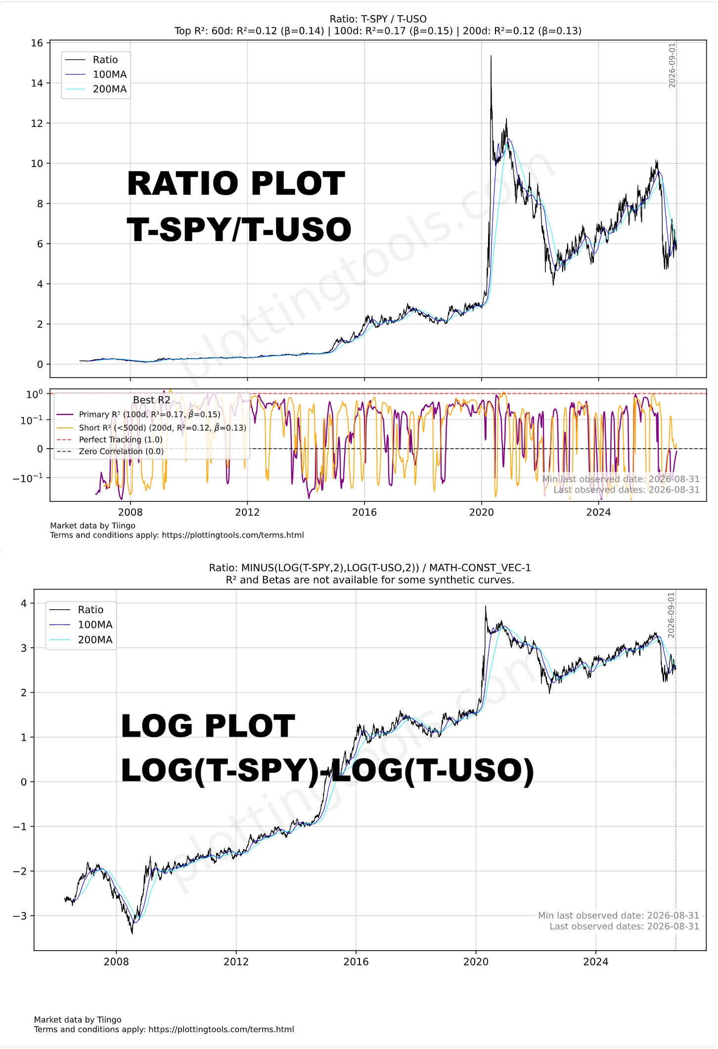
This means the ratio plotter charts are useful for some cases such as: (1) Buffett indicators, (2) When two stocks that are very similar like two World Stock Indexes or two competing stocks. (3) When you want to play with the curve, divide it by an exponential, apply other funtions such as RAT(TICKER, LAG(TICKER,30)) which divides a dicker by itself lagged 20 days. Even in the above examples, the upside of the curve will be typically stretched-up more than the downside below the average because of the doubling from 0.5 to 1 covering smaller distance than doubling from 2 to 4, and also the average will be shifted upwards by a considerable amount, impacting your reversal to the mean judgement. Also over the long term the curve on the ratio plot often looks like an exponential which makes it difficult to see past trends on the same scale as current trends. Dividing the ratio curve by an exponential may lessen this, but it is not the automated, ideal approach offered here.
ETF Consistency: When plotting the ratio between two ETF's, always check that both are either distributing or accumulating. If this is not the case dividends can effect the results significantly!
R2 and ADF p: Ensure the R2 and ADF p point to a good quality model which can be used for trading (see table below).
Recommendation: Always check the seasonality plot of the ticker you intend to swing trade; ensure the historical seasonality isn't moving against your position.
Stationarity & Mean Reversion (ADF Test)
Traders often assume that over the long term, stocks and commodities will reliably mean-revert to a historical relationship. This dynamic reflects Benjamin Graham’s famous maxim: in the short term, the market is a voting machine driven by momentum, but in the long term, it is a weighing machine. The challenge for pairs traders is quantifying this underlying fundamental gravity when short-term price action rarely moves in perfect lockstep, which often causes R2 to break apart.
The solution to the problem above is the Augmented Dickey-Fuller (ADF) test. While traditional correlation measures such as R2 measure how assets move together, the ADF test measures the statistical gravity pulling their spread back to equilibrium by testing the regression residuals for stationarity (the longer term weighing machine from Benjamin Graham).
Understanding the ADF p-value: Lower ADF p-values are strictly better for mean-reversion strategies. A p-value of 0.01 means there is only a 1% probability that the spread's divergence is a permanent drift. It confirms that the residuals of the model will eventually gravitate back to zero.
Comparing the R2 against the ADF p-value reveals the true structural relationship of the assets:
R2: Good/High (e.g. 0.9) |
ADF p-value: Bad/High (e.g. 0.9)
Assets appear highly correlated because both are riding a macro tide, but their spread is untethered. This is a ticking time bomb for a pairs trade.
R2:
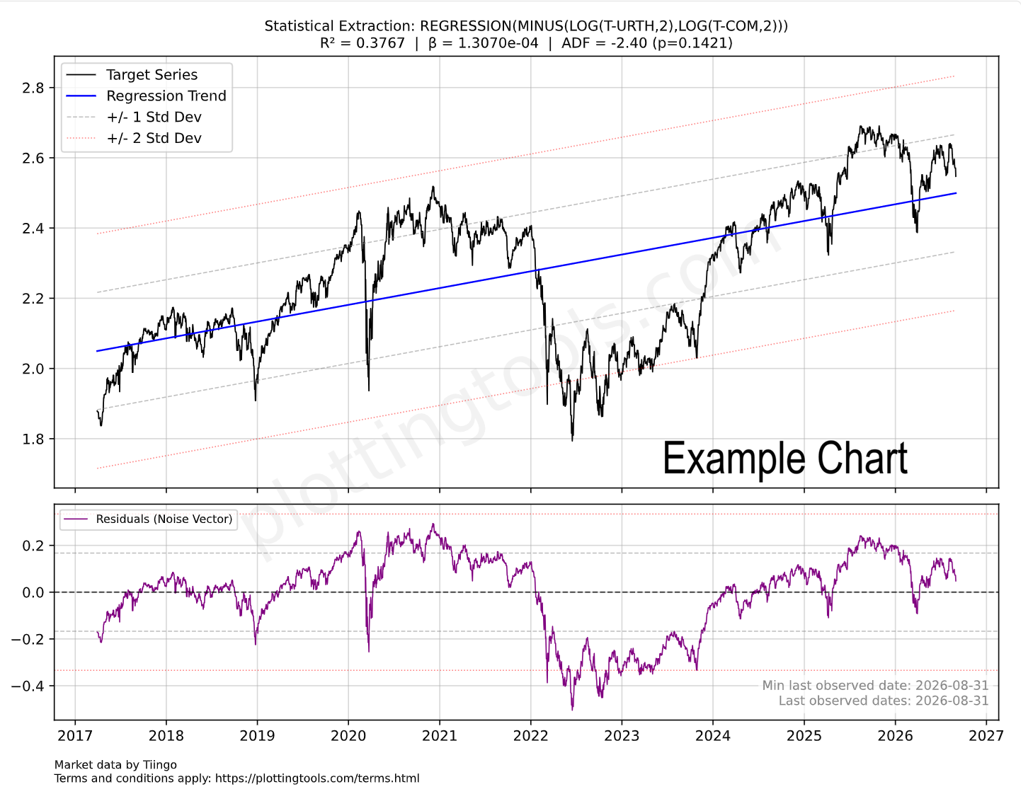
Low/Mediocre (e.g. 0.37) |
ADF p-value: Good/Low (e.g. 0.15)
Assets do not move in daily lockstep, but their valuation ratio eventually corrects. This offers mathematically sound mean-reversion setups.
In our stock and commodity model, a mediocre R2 of 0.37 simply means the assets do not perfectly mirror each other day-to-day. However, a statistically good ADF p-value (e.g. 0.14) proves that the market will eventually act as a weighing machine, pulling the asset prices back into their historical relationship.
Stationarity & Mean Reversion (ADF Test)
ADF Statistic (The Tension): Measures the mean-reverting "rubber band" effect. A highly negative number (e.g., -3.85) means strong tension pulling the spread back to the baseline. Numbers closer to zero (e.g., -1.10) indicate a loose, drifting spread.
p-value (The Fluke Probability): The chance this tension is just a random coincidence. A p-value of 0.0120 means there is only a 1.2% chance the signal is a fluke, meaning you can trust the signal with 98.8% confidence. A p-value of 0.6500 means there is a 65% chance it is a fluke, indicating a random walk you should avoid trading.
R2 and Beta Analysis Summary for Ratio Trading
To ensure a Ratio trade is based on structural correlation rather than random price movement, the R2 and Beta must BOTH be significant.
A low R2 indicates that Asset A and Asset B are "decoupled," meaning any apparent pattern in the Ratio is likely statistical noise with no mathematical pressure to return to the mean. Conversely, a high R2 confirms the assets are "tethered," making mean-reversion strategies reliable.
Besides the R2 we also need to make sure the Beta is healthy. The Beta between two assets indicates how much the numerator moves relative to the denominator. To use the Beta you can use this simple formula: Expected Numerator performance ≈ Denominator performance × Beta value.
A static Beta may mask recent shifts in relative volatility. To ensure your position sizing remains accurate, compare the overall Beta with the rolling Beta windows in the bottom dashboard pane. Monitoring these short-term fluctuations helps distinguish between normal market noise and a fundamental shift in how aggressively one asset moves compared to the other.
Statistical Warning: The R2 Validity Test
The following table defines the boundaries between random noise and actionable correlation based R2 values:
EXTREME CAUTION.
The assets are practically decoupled. No statistical reason for the Ratio to return to the mean.
Assets with a R2 value in this range can be used for diversifying portfolios.
CAUTION.
Significant risk of "drift" where the Ratio diverges permanently from historical averages.
Assets with an R2 value in this range provide little value for both diversification and mean reversion trading.
OPTIMAL.
Assets are tethered. High probability of mean reversion when the Ratio stretches.
Assets with an R2 value in this range are ideal for mean reversion trading.
Statistical Warning: The Beta Validity Test
The following table defines the boundaries between Inverse Ratio, Low volatility and high volatility asset pairs.
ATTENTION.
The assets move in opposite directions. A Beta of -1.0 indicates equal volatility but inverse movement. Assets in this range are primarily used for hedging strategies rather than standard Ratio trading.
EXTREME CAUTION.
The numerator asset is significantly less volatile than the denominator. The ratio will move slowly unless position sizing is adjusted.
Assets with Betas in this range can be used for diversifying portfolios.
OPTIMAL.
Both assets exhibit similar volatility profiles, meaning neither will easily overpower the other during price swings. This balance makes the pair optimal for standard 1:1 ratio trading, allowing for predictable mean reversion without the need for complex position sizing adjustments.
CAUTION.
The numerator is highly volatile relative to the denominator. While the assets may be correlated, this severe imbalance requires careful position sizing to prevent the numerator from overpowering the trade.
*Note: RatioPlotter.eu uses periodic returns (relative changes) to ensure the Beta and R2 reflect the structural relationship regardless of the absolute currency price of the assets.
Ticker Data Usage and Sourcing
Ticker Data Sources
RAT() Ticker function
LAG() Ticker function
MATH- Tickers
CURVE_FROM_VECTOR()
CURVE_FROM_VECTOR([198.27, 211.92, 245.12, 281.72, 318.27], '2026-06-30', 'last', '1y', 'linear', 'forward_fill')
The first argument is the time ordered list of data points, separated by commas. The second argument ('2026-06-30') is the one data anchor we need to plot these values over time.
The third argument ('last') tells the system to apply the anchor date to the last value, another value for this parameter is 'first'.
The '1y' tells the values fall on the exact same date on each year (or closest if leap year).
The '1y' could also be '1q' or '1m' for quarter or month. The same considerations made for year apply.
The 'linear' parameter tells the system how to interpolate the values for days in between the value data points given, another possible value here is 'forward_fill'.
The 'forward_fill' last parameter is about the extrapolation, its possible values are: 'none', 'forward_fill', 'linear'.
Default Ticker Column Projections & Adjustments
Plotting Dividends Reinvested at Your Portfolio Return Rate
This is a function available only for users with the advanced subscription. The first argument is the Ticker simulated, the second is your portfolio CAGR rate (in this case 0.25 = 25% yoy). We apply the daily equivalent rate though. The third argument is the initial investment in the currency of the stock ticker. The last argument is the start date. For a full example see our article on dividend reinvestment simulation or our article looking back at Warren Buffet's investment in Coca-Cola and the results of its juicy dividends.
Calculating slope, velocity, or derivating (these are all synonyms)
Z scaling, bringing data to the normal curve Z score scale, normalizing
This is a function available only for users with the advanced subscription. The single argument can be a Ticker or another vector function. For a full example see our macro quadrant plot.
REGRESSION() and RESIDUALS() Functions
(1) The REGRESSION or RESIDUAL functions are reserved for paying users, apart from the free tier REGRESSION examples present on the log plot page.
(2) When the REGRESSION function is the outermost function of the expression and is used on the log plotter, it will cause a nice regression plot canvas to display the fitting line and useful regression statistics such as ADF probability R2.
If the regression function is used elsewhere by the paying user, such as on the regular ratio plotter page it will plot the curve made by the residuals of the regression, it will plot the residuals vector of for instance this expression: REGRESSION(RAT(RAT(T-URTH, T-COM), MATH-CAGR_PCT-6)). I criticize this use of REGRESSION(), as it sort of guesses the trend as 6% anual growth to flatten the exponential as a line and then applies the regression. The log plots do this optimal guessing automatically in a more robust manner.